Create and Skin a Photo Gallery with Flickr, Flex and Actionscript 3.0
by 4 May, 2009 12:30 pm3
In this Flex tutorial we will show you how to create a simple Flex photo gallery that uses the Flickr Feeds to obtain the photos. You will also learn how to use custom skins, HTTPRequest’s and custom components.
Requirements
Pre-Requesites
For this tutorial you will need a basic understand of the Actionscript 3 language, and a basic understand of the Flex Framework and Flex Builder 3.
Creating the Project
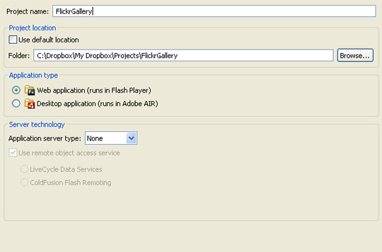
The first thing we are going to do is fire up Flex Builder and create a new project that will run as a web application. You project settings dialogue should look like mine below. Once they do, click Finish.
Creating the layout.
Now that we have a Flex project set up it is time to start creating the layout. In the application we only have two components. They are a button – for the user to run the query, and a list box to display the results. Now, find the ‘Components’ panel which is usually located in the bottom left of the layout, and drag a ‘Button’ component out onto the stage.Finally, set the label property to ‘Get Latest Photos’.
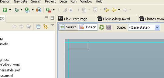
Then, go to the ‘Layout’ sections of the property’s panel while the button you just created is selected.You should see a ‘Constraints’ section, make sure the top left two check boxes are selected. This makes sure that no matter how much the application is resized, the button will stay in the top left of the window. This is what the Constraints section should look like once you have finished.
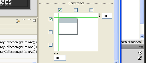
Next, drag a list box component out into the stage. Next set the ‘Constraints’ settings as the same as below.
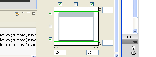
Now, onto the code! HTTPService.
Once you have done this, go to the Source view. Add this code above the List component.
<mx:HTTPService url="http://api.flickr.com/services/feeds/photos_public.gne" id="photoSearch" result="traceData(event)"/>
This code is the code that gets the latest added photos to Flickr and makes them available to you in your Flex app ready for use. The first parameter is url and this is just the URL to the feed you want to get. This could be an XML feed, and Atom feed or many many other types of feed. The next parameter is id and this is just a name you can use to reference to the HTTPService. You can think of this as a variable name. The last one is an event handler which is called when the request is completed and the data is at hand.The function name is ‘traceData’ and it is passed an event item, which if you are familiar with Actionscript, you should know what this is.
Add the Actionscript.
As with all Flex applications, to add Actionscript to a flex application you have to add the <mx:Script> tag. Here is what it looks like.
<mx:Script>

  <![CDATA[

  // Actionscript code goes here.

	]]>

</mx:Script>
That is the basic template for adding Actionscript. Now here is the final code that we will put into out app.Add it above all the other code, but below the <mx:Application> tag. Have a look through then I’ll go on to explain it.
<mx:Script>
	<![CDATA[
		import mx.events.ListEvent;
		import mx.rpc.events.ResultEvent;
		import mx.collections.ArrayCollection;

		[Bindable]
		private var photosArray:ArrayCollection;

		private function runSearch(e:MouseEvent):void
		{
			photoSearch.send();
		}

		private function traceData(e:ResultEvent):void
		{
			photosArray = e.result.feed.entry as ArrayCollection;
		}
	]]>
</mx:Script>
There you go, the meaty part of the app. Here’s the lowdown on what going on.
- The necessary classes are being imported, so we can use that functionality in the Flex app.
- We are creating 1 variable to hold the photo data we got from the HTTPService (note, we don’t actually download the photos to out Flex app, just the web location of the photo file) and this is of type Array collection which just means it’s an Array with extra methods and properties added to it. See more here. You will notice there is the text ‘[Bindable]’ above the variable. This is there to let Flex know that we want to be able to access the variable outside of our ‘<mx:Script>’ tag.
- After that we have a function called ‘runSearch’ which is used to tell the HTTPService to go and get the data from the Flickr feed. Later we will hook this up to the button we dragged out earlier so this function is run every time the button is clicked.
- Finally we have a function called ‘traceData’, now this puts the data retrieved from the Flickr feed into the variable, ‘photosArray’.
So there you go, that is all the Actionscript required for this app.
Adding functionality to the button & list.
As I mentioned earlier, we have a function that needs to be run when the button we created is click. The way we do this is to add this parameter to the button code. What this does is add an event listener to the button which means every time the button is clicked, then this function will be run.
click="runSearch(event)"
Also, in the List component you need to change it to look like this. Here is what the final code for the List component should look like
<mx:List itemRenderer="Photos" dataProvider="{photosArray}" id="photoList" enabled="true" bottom="10" left="10" top="50" borderThickness="1" borderStyle="solid" right="10"></mx:List>
Now you will see we have changed the List code a bit. What we have done is tell it to make a copy of our custom component we are going to create and use it for each item in the list. The next param is telling the List component to be populated with the data from the data we got from the HTTPService. Next, like with the HTTPService we have an id.
Creating the custom list component.
The last major part of this tutorial is creating the custom component that is going to be used to display a single photo with additional data next to it. The way this works is that, in the list, for every photo retrieved, a copy of the component is added to the list. At the end you are left with a list of these custom components each displaying a different component. Now onto creating the component.
Goto File > New > MXML Component.
You will be presented with a dialogue box which you should make to look like this.
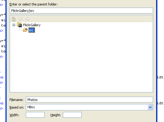
It is all fairly obvious what everything does here except the ‘Based on’ property. This means that it inherits the layout of the Hbox component.So there we go, we now how a basic MXML component. Custom components can be created through the use of pure Actionscript, see here.
Adding functionality to the component.
Now we have a blank custom component. Here is the code that we need to put into the Source view below the <?xml> tag
<mx:HBox xmlns:mx="http://www.adobe.com/2006/mxml" xmlns:net="flash.net.*">
	<net:URLRequest id="photoURL" url="{data.link[1].href}"/>
	<net:URLRequest id="profileURL" url="{data.author.uri}"/>

	<mx:Image width="224" height="154" source="{data.link[1].href}"/>
	<mx:Grid width="100%">
		<mx:GridRow width="100%" height="100%">
			<mx:GridItem width="100%" height="100%">
				<mx:Text text="Authors Name: {data.author.name}" width="30%"/>
			</mx:GridItem>
		</mx:GridRow>
		<mx:GridRow width="100%" height="100%">
			<mx:GridItem width="100%" height="100%">
				<mx:Text text="Image Title: {data.title}" width="30%"/>
			</mx:GridItem>
		</mx:GridRow>
		<mx:GridRow width="100%" height="100%">
			<mx:GridItem width="100%" height="100%">
				<mx:Text text="Image Type: {data.link[1].type}" width="30%"/>
			</mx:GridItem>
		</mx:GridRow>
		<mx:GridRow>
			<mx:GridItem>
				<mx:Button label="Goto Original Image." click="navigateToURL(photoURL)" width="200" />
			</mx:GridItem>
			</mx:GridRow>
			<mx:GridRow>
			<mx:GridItem>
				<mx:Button label="Goto User Profile." click="navigateToURL(profileURL)" width="200" />
			</mx:GridItem>
		</mx:GridRow>
	</mx:Grid>
</mx:HBox>
Now this code is fairly simple if you have a basic understanding of Flex. All we do is create a Grid component and then add various items to it. The one thing that does deserve to be explained is the ‘text’ property of the Text component. The {} (curly braces) are there to tell Flex that we want to access data from a variable, which is called data binding. In the step ‘Adding functionality to the button’ you see that we added a ‘dataProvider’ parameter to the list box, now this enabled the custom component to access data from the HTTPService, therefore we can now get the image URL, author and all the other data from the Flickr Feed, right from within the Photo.mxml file! All we do now in the text property is get the respective item of data from the feed.
So now, every item in the List component will be a copy of this, each representing a different photo. The bottom two GridItems are a bit different as they contain buttons that link offsite to the original image and the user profile respectively.
Adding the custom skin
Now for the last part of this tutorial we will add the custom skin that you see in the demo app. Now there are two ways in which you can skin your Flex app. One it to create your own skins or just download a free set from a site like Scalenine.com. Now because creating you own skins in a tutorial in its own right, I am gonna go ahead and download a skin from ScaleNine. So go ahead a go to Scalenine.com and for this tutorial I’m going to use the skin ‘Undefined Skin One’, which at the time was in the featured section on the homepage. Now you should see an arrow just below the skin title pointing downwards. Click this and you should get a .ZIP file containing all the nessary skin files. Unzip it and go into the ‘src’ directory.

From here on in I am assuming you are working with the skin I mentioned earlier as this may vary from skin to skin. Locate the ‘css’ and ‘assets’ folders and drag them into Flex builder, into your ‘src’ directory.

Now, the .CSS file in the ‘css’ (where else?) folder contains style infomation for nearly every component of the Flex framework, but we are only using two so it would be unessary to have all the extra component style infomation in our project. To get around this, all we have to do is to create a new .CSS file and put it in the ‘css’ folder and copy and paste in the style infomation we need from the original file into out new style(css) file. So, to do this create a file called ‘style.css’ and paste the following code into it.
CursorManager
{
	busy-cursor: Embed("assets/UndefinedPersonalSkinLoad.swf");
}

Application
{
	font-family: 				franklin;
	font-size: 					11;
	color: 						#333333;
	background-gradient-alphas: 0, 0;
	background-color: 			#666666;
	theme-color: 				#333333;
	font-weight:				normal;
	background-image:			Embed("/assets/general/fondo3.jpg");
	background-size:			"100%";
	modal-transparency-color:	#000000;
	modal-transparency-blur:	2;
}

.buttonOfficial
{
	up-skin:        		Embed("/assets/botones/boton.png", scaleGridTop="6", scaleGridBottom="14", scaleGridLeft="6", scaleGridRight="14");
	over-skin:      		Embed("/assets/botones/boton1.png", scaleGridTop="6", scaleGridBottom="14", scaleGridLeft="6", scaleGridRight="14");
	down-skin:      		Embed("/assets/botones/boton2.png", scaleGridTop="6", scaleGridBottom="14", scaleGridLeft="6", scaleGridRight="14");
	disabled-skin:			Embed("/assets/botones/boton_dis.png", scaleGridTop="6", scaleGridBottom="14", scaleGridLeft="6", scaleGridRight="11");

	color: 					#e8e8e8;
	font-family: 			franklin1;

	padding-left: 			6;
	padding-right: 			6;

	text-roll-over-color: 	#e8e8e8;
	text-selected-color: 	#cccccc;
}

/*
------------------------------------------------------------------------
LIST
------------------------------------------------------------------------
*/

List
{
	font-family:				franklin;
	font-weight:				normal;
	font-size:					11;
	color:						#333333;
	text-roll-over-color:		#333333;
	text-selected-color:		#333333;
	roll-over-color:			#e4e4e4;
	selection-color:			#cdcdcd;
	alternating-item-colors:	#f8f8f8, #ffffff;
}

ScrollBar
{
	up-arrow-up-skin: 		Embed("/assets/botones/Scroll_up.png" );
	up-arrow-over-skin:		Embed("/assets/botones/Scroll_up.png");
	up-arrow-down-skin:		Embed("/assets/botones/Scroll_up1.png");

	down-arrow-up-skin:		Embed("/assets/botones/Scroll_down.png" );
	down-arrow-over-skin:	Embed("/assets/botones/Scroll_down.png");
	down-arrow-down-skin:	Embed("/assets/botones/Scroll_down1.png");

	thumb-up-skin:			Embed("/assets/botones/Scroll_barra.png", scaleGridTop="3", scaleGridBottom="7", scaleGridLeft="2", scaleGridRight="11");
	thumb-over-skin:		Embed("/assets/botones/Scroll_barra1.png", scaleGridTop="3", scaleGridBottom="7", scaleGridLeft="2", scaleGridRight="11");
	thumb-down-skin:		Embed("/assets/botones/Scroll_barra2.png", scaleGridTop="3", scaleGridBottom="7", scaleGridLeft="2", scaleGridRight="11");

	track-skin: 			Embed("/assets/botones/Scroll_fondo.png", scaleGridTop="17", scaleGridBottom="28", scaleGridLeft="3", scaleGridRight="12");
	/*track-down-skin: 		Embed("/assets/botones/Scroll_fondo.png", scaleGridTop="26", scaleGridBottom="28", scaleGridLeft="8", scaleGridRight="9");*/

	thumb-icon:				Embed("/assets/botones/Scroll_icon.png");
}
Here you can see that we have the code for the list and button components. We also have the code for the scroll bar. This is because the list component, when containing more that it can show visually, uses a scroll bar so we can scroll through the contents. This is what the ‘ScrollBar’ style code is for, to style the scroll bar!
The last thing to do is add this line to the top of your Flex application.
<mx:Style source="css/style.css"/>
All this tells Flex to do is import the style sheet containing all the infomation. Please note that all the credit for the Flex skin used in this tutorial goes to Undefined


