Google Chrome OS Now Looks Like Windows?
by 10 April, 2012 4:30 pm0
Google has come around to the OS side of things and decided to update their Google Chrome OS to be more… well, traditional OS-y.
The original Chrome OS was all presented through a single browser window, that had side opening tabs and a special tab for installed applications. There were no additional menus, pop-ups or windows in the OS, and the minimalist design helped to produce a very streamlined user experience.
Apparently Google developers felt the OS needed a little more visually because the latest build looks a lot more like, well, Windows.

The Original Google Chrome OS
The original Google Chrome OS, which launched in 2010, was designed to provide users with a single intuitive interface that didn’t use too many menus.
In an earlier article we discussed exactly what the Google Chrome OS was:
“Google has identified that users spend most of their time on a computer in a browser window (Internet Explorer, Firefox, Google Chrome, Safari). They believe that most of the excess programs and applications are used, much less often – enough so, that they don’t need to exist in an OS. They also believe that most average operating systems take an extended period of time to boot initially (no detesting that fact).
Over time operating systems deteriorate in performance as more and more software is installed. Armed with all these aforementioned observations, Google has decided it would be beneficial to create an operating system that acts just as an internet browser. What that means is that every action performed on their upcoming OS will do so via the internet. The Google OS is titled the Chromium OS because it will obviously borrow from the design and function of Google’s Chrome internet browser.”
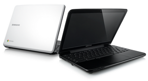
After Google’s OS was fleshed out with more features, they worked to release several netbooks which were manufactured to specifically utilize the Chrome operating system – the new netbooks were branded with the Google Chromebook title.
The New Google Chrome OS
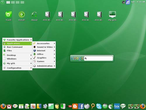 Google recently released a new update to the developer version of Chrome OS, which changes the entire visual theme of the operating system. The new visual aesthetics and features are actually the first updates to the operating system’s user interface since launch.
The new Chrome OS update adds a more traditional desktop interface, which in turn offers separate application and browser windows. Basically Google has designed the Chrome OS to be more like a traditional operating system. The new Chrome OS version even has a popup taskbar which Google calls a “shelf”, that offers quick shortcuts and convenient application icons to allow faster navigation options. The inclusion of the taskbar also gives birth to a similar feature (much like the Windows start-menu), which adds a more extensive list of available applications and programs.
Google is calling the interface redesign ‘Aura‘.
Of course, Google has still maintained the “minimalist” design in the latest update, and they are still dedicated to providing a speedy piece of software. This new update will hopefully work to improve the Chrome OS and will work to expand its use to familiar territory. Google is obviously hoping that these new, and more traditional features will appeal to a larger audience.
Google Chrome OS Looks More Like Windows
 Don’t get us wrong here, although the Google Chrome OS does look a lot more like Windows now than it ever used to, it still offers a completely different experience from other operating systems already out there. As we’ve mentioned above, Google is obviously trying to lure in a much larger audience by offering a familiar experience to most, and that’s exactly what this latest update offers.
Previously, the Chrome OS had a tendency to become very -inhibiting- as far as features go. Users could only navigate using a single browser window, and if they wanted to launch an installed application they were forced to open a new tab and browse a list. Of course, we’re not attacking the classic Chrome OS interface, we’re just saying that sometimes its simple design got in the way and made things take a little longer than they should.
The new update opens a lot more opportunities and makes things run a lot smoother. We’re fairly confident that Google’s promises to maintain “speedy, simplicity, and security” with their Chrome OS hold up even with the latest update, and we’re looking forward to seeing what will come of these new features.
If you want to see some images of the new Chrome OS check out CNET’s gallery.
